
홍승욱 展
" 사랑(LOVE)展 "
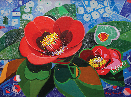
Love10_72.7x53cm_Oil on canvas
![]()
갤러리 라메르
2016. 3. 2(수) ▶ 2016. 3. 15(화)
Opening 2016. 3. 2(수) PM 5:30
서울시 종로구 인사동 194 홍익빌딩 | T.02-730-5454
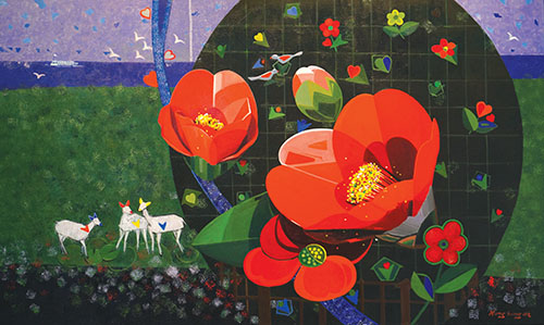
Love16_162.2x97cm_Oil on canvas
단아한 형태, 화사한 순색이 조화로운 사랑의 미학
유채화의 아름다움은 발색에 있다. 물감 그대로의 순색을 쓸 경우 마치 보석처럼 빛난다. 인상파 화가들의 작품을 보면 금세 붓을 놓았다는 느낌이 들 정도로 맑고 화사하다. 이는 순색의 병치라는, 점묘법이 만들어낸 회화사의 일대혁신의 성과이다. 순색의 아름다움은 원색적인 이미지 소재에서 더욱 증폭된다. 그런 의미에서 어쩌면 유채화는 물감 자체의 색채 즉, 순색을 아름답게 배열해 놓는 것만으로도 충분히 아름답다고 할 수 있지 않을까.
홍승욱의 최근 작업은 유채화의 아름다움이 어디에 있는지를 여실히 보여준다. 붉은 색의 동백꽃이 대다수를 차지하는 근래 작품은 화려한 원색 중심이다. 그러기에 자극적인데도 결코 과하다는 느낌이 들지 않는다. 머리를 맑게 하고 감정을 끌어올리는 색채이미지여서 시각적인 흡인력이 높다. 순색의 사용 빈도가 높음에도 불구하고 차분하게 감정을 고조시킨다. 이는 현란하다는 느낌이 억제되는 절제된 색감 그리고 순연한 색채대비 및 조화에 기인한다.
무거우면서도 진중하게 처리되는 그의 물감 배열방식은 발색이 난하지 않아 시각적인 피로감이 느껴지지 않는다. 이는 세련된 조형감각의 소산이다. 구체적인 형태묘사 대신에 간명한 선과 평면적인 구성으로 이루어지는 조형언어는 견고한 조형적인 감각이 뒷받침하고 있다. 어디 한 군데도 애매하거나 모호하지 않고 명료하고 단정하여 조형적인 신뢰감을 준다.
한마디로 견실한 사실묘사를 기반으로 하기에 형태를 단순화하고 변형하거나 왜곡하더라도 납득할 수 있다. 구성적인 안정과 색채의 아름다움, 특히 순색이 빛을 발하고 있기 때문이다. 그의 작업은 이렇듯이 견실한 사실묘사를 기반으로 하는 안정적인 조형감각으로부터 시작된다. 그러기에 원색적인 색채이미지임에도 경박하지 않고 진중하며 사려 깊다는 느낌이다.
꽃의 형태를 의식하기 전에 먼저 시선을 빼앗는 것은 화려한 색채이미지이다. 그의 작품에서 감지되는 시각적인 쾌감은 다름 아닌 원색적인 이미지로부터 비롯된다. 무엇보다도 보석처럼 빛나는 화려한 원색적인 이미지가 시선을 사로잡는다. 눈부신 햇살에 숨김없이 드러나는, 형형색색의 꽃밭에서 발산하는 생명의 광휘를 연상케 한다. 밝고 맑으며 화려한 색깔로 치장한 작품들은 실로 첫눈에 반할만한 시각적인 쾌감 및 생동감을 수반한다.
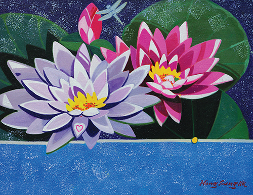
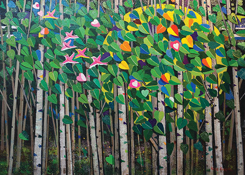
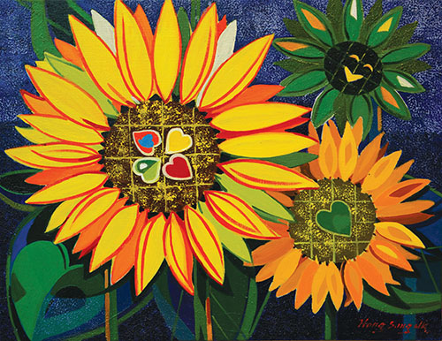
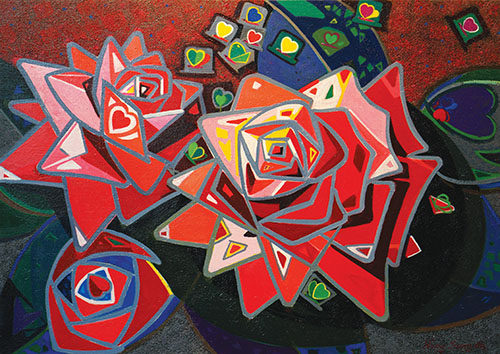
자연에 존재하는 수많은 소재 가운데 원색적인 꽃은 인간의 눈을 현혹할만한 아름다움을 지니고 있다. 따라서 원색으로 이루어진 꽃은 물감이 가지고 있는 순색의 아름다움을 부각시키기에는 최적의 소재이다. 실제로 동백, 해바라기, 연꽃, 수련, 장미, 튤립, 자작나무 등을 소재로 하는 그의 작품에서는 순색이 지어내는 발색의 아름다움이 유난히 도드라져 보인다. 순색으로서의 유채 물감이 가지고 있는 시각적인 아름다움을 마음껏 부추기고 있다는 인상이기에 그렇다.
꽃이라는 소재를 통해 표현되는 순색의 아름다움은 눈과 마음이 맑아지는 듯싶은 기분 좋은 색채이미지의 조합에서 비롯된다. 꽃의 색깔에 필적하는 아니, 그 이상의 아름다움을 지닌 유채 물감의 순색은 생명의 기운을 일깨우는 힘을 지니고 있는 듯싶다.
이렇듯이 그의 작품에서 순색의 아름다움이 돋보이는 것은 평면적인 이미지와 무관하지 않다. 다시 말해 꽃의 형태를 평면적으로 표현하는 조형적인 기법과 연관성이 있다. 꽃의 형태를 단순하고 간결하게 표현함으로써 시각적인 인상이 명료하다. 무슨 꽃, 어떤 소재이든 형태를 평면적으로 단순화시킨다. 평면적으로 간명하게 함축되는 꽃의 이미지에서 순색은 한층 선명하게 부각되기 마련이다.
그의 작업에서 꽃은 실제의 크기보다 몇 배 아니, 몇 십 배 확대되는 일이 적지 않다. 뿐만 아니라 화면에서 차지하는 면적이 넓다보니 꽃 한 송이가 화면 전체를 지배하는 형국이다. 이렇듯이 특정의 소재를 확대하는 과장된 표현방식은 현대회화에서는 보편화되어 있다. 비현실적인 크기에서 비롯되는 시각적인 압박감은 또 다른 형태의 시각적인 체험이자 미적인 충격이다. 비현실적으로 확대된 이미지는 일상적인 시각에서 벗어나는 다른 차원의 미적체험을 제공하는 것이다.
소재로 채용하는 꽃은 대체로 그 크기가 큰 편에 속하는데 반해 꽃잎의 수는 그리 많지 않다. 물론 장미나 해바라기는 꽃의 크기도 클뿐더러 꽃잎도 많다. 그러나 작품의 대다수를 차지하는 동백꽃은 그 모양새가 간소하다. 동백꽃은 크기나 모양새가 단순하여 크기를 확대했을 때 꽃잎 하나의 크기가 크게 보인다. 이는 꽃잎이 커짐과 동시에 화면을 차지하는 면적이 커지는데 따른 자연스러운 시각적인 효과이다.
Love18_53x40.9cm_Oil on canvas
그는 여기에서 단순히 꽃의 크기를 확대해 놓는데 그치지 않고 공간의 확장 및 심도에 대한 문제를 고민하게 된다. 꽃이 비현실적으로 확대됨으로써 비롯되는 시각적인 압박감 및 강렬한 이미지만으로는 설득력이 약하다. 다시 말해 자기복제의 함정에서 벗어나기 어렵다. 크기가 확대된 꽃만을 지속적으로 그린다는 것은 자기복제일 수밖에 없다. 그래서 현대회화의 한 속성인 조형적인 변주를 통해 보다 다양하고 풍부한 시각적인 효과 및 내용을 모색하게 된 것이다.
동일한 소재를 반복적으로 그릴 경우에도 다양한 조형적인 변주를 통해 소재주의라는 함정에서 탈피할 수 있다. 그의 작업에서 동백꽃이 지속적으로 등장하는데도 지루하지 않은 것은 조형적인 변주라는 방법을 구사한 결과이다. 동일한 소재의 경우 형태나 크기, 그리고 다양한 배치방식으로 개별성을 부여한다. 뿐만 아니라 배경처리와 관련해 추상적인 이미지를 받아들임으로써 보다 다양하고 풍부한 조형적인 변주가 가능케 된 것이다.
작품에 따라 기하학적인 이미지 및 하트모양의 이미지 그리고 작은 들꽃이나 사슴, 새, 잠자리, 나비, 눈사람, 장난감 기차 또는 문자 따위를 끼워 넣는다. 특히 하트 이미지는 작품마다 거의 빠짐없이 등장시킨다. 이와 같은 부수적인 이미지들이 함께 하면서 작품마다 독립적인 이미지 및 내용을 지니게 된다. 동백꽃을 중심으로 하여 추상적인 이미지가 배치되고 위에 열거한 소재들이 적절히 배치되면서 작품마다 독립적인 스토리를 형성한다.
소재의 배치 및 구성에 따라 작품마다 고유의 스토리가 만들어지고 이로써 형식과 내용이 조화를 이루게 된다. 이러한 이미지 구성 및 내용은 어쩌면 소재주의로 빠질 수도 있는 위험으로부터 벗어나는 조형의 묘수인 셈이다. 중심적인 소재의 존재감을 더욱 강조하는 부수적인 소재는 문학적인 서술에 근사한 다양한 내용을 만드는데 기여한다.
주제인 꽃의 존재감을 부각시키는데 기능할 뿐만 아니라 풍경화에 가까운 공간적인 확장 및 깊이에도 영향을 미친다. 화면의 중심을 차지하는 꽃에 비해 상대적으로 아주 작게 보이는 부제로서의 이미지들로 인한 대비는 돌연 풍경적인 공간감이라는 상황을 연출하게 된다. 큰 꽃과 부수적인 이미지의 대비 및 조화는 공간의 심도 및 크기를 결정하는데 따른 조형적인 기술의 하나이다.
작품마다 거의 빠짐없이 등장하는 하트 이미지는 꽃의 형태에 절묘하게 어우러진다. 단출하면서도 단아하게 이어지는 곡선의 하트 이미지는 깜찍하고 예쁘다. 이런 모양의 하트 이미지는 작품에서 빠질 수 없는 감칠맛 나는 양념의 역할을 한다. 하트 이미지는 <사랑>이라는 명제를 더욱 실감나게 만드는 데 일조를 한다. 또한 세련된 형태미를 만들어내는 매끄럽고 유연한 곡선의 흐름은 하트 이미지의 존재를 더욱 사랑스럽게 부각시킨다.
그의 작품에 등장하는 모든 소재들이 사랑스럽고 단아하며 부드럽게 느껴지는 것은 유연한 흐름을 가지고 있는 곡선에 있다. 평면적인 이미지와 결속되는 세련된 곡선의 흐름은 전체적인 작품의 인상을 결정짓는데 중요한 역할을 한다. 결코 급박하지 않으며 여유롭고 느긋하면서도 간결하게 처리되는 곡선의 아름다움은 탐미적인 가치를 지니고 있다. 군더더기 없이 그리고 매끄러운 가운데 단호하게 마무리되는 곡선미야말로 그의 작품이 지닌 조형적인 세련미와 직결된다.
꽃이라는 소재는 형태 및 색채만으로도 탐미적인 화가들의 시선을 현혹하고도 남음이 있다. 그러기에 수많은 화가들이 다투어 꽃을 찬미한다. 저마다 다른 시각, 다른 미적 감수성으로 꽃의 아름다움을 재해석한다. 그가 꽃을 찬미하는 대열에 합류한 것은 이전의 화가들과는 또 다른 심미적인 해석에 대한 가능성을 보았기 때문이리라. 실제로 꽃을 소재로 한 일련의 근작들은 자연주의적인 이전의 작품과는 확연히 다른 주관적인 시각을 통해 새로운 조형세계로 진입하는데 성공하고 있다.
꽃이라는 보편적인 소재를 채택, 새로운 조형적인 해석이라는 성과를 얻기란 쉽지 않다. 하지만 그는 실제의 꽃보다도 더 강렬한 원색적인 색채를 구사하여 눈과 마음을 즐겁게 하는 미적 쾌감을 맛보게 한다. 작품 명제인 <사랑>이라는 단어가 가지고 있는 의미를 작품 이미지에 대입시켜 음미하는 것도 하나의 감상 포인트일 것이다. 그의 작품과 마주하고서 감지, 감득하는 여러 감정 가운데 <사랑>은 그 으뜸일 수 있다. 형태 및 색채 그리고 구성이 서로 화합하고 조화를 이루면서 사랑의 감정을 발설하는데 입을 모으고 있기 때문이리라.
신 항 섭 (미술평론가)
Love23_91x65.2cm_Oil on canvas
Love esthetics where a graceful shape and bright colors are well harmonized
The beauty of an oil painting may ascribe to coloring. It may shines like jewelry when pure colors are employed. Watching the works of impressionist painters, we feel that the colors are so bright and shining as if they are finished right this moment. The effect is from an innovative technique of art, called Pointage created by juxtaposing pure colors. Such beauty stands out more in the primary color images. An oil painting, therefore, may be appreciated more beautifully by the original colors-just by arranging unmixed original colors skillfully.
Hong Sung-Uk¡¯s recent works sufficiently stress the points to which the beauty of oil paintings can be ascribed. Majority of his recent works are composed of red camellia flowers portrayed in brilliant primary colors. Even though his works are provocative, they do not give any feeling of ¡®excessiveness.¡¯ With the colors and images that purify and exalt our emotion, his works absorb all our attention. Despite of his frequent use of pure colors, his paintings sooth our emotion calmly. Such feeling may derive from restrained color sense and outright color contrast and color harmony.
His way of color arrangement-treated in grave but careful manner-does not fatigue our eyes because the color formation is not loud. That is an outcome of refined formative sense. The formative language composed of only simple lines and flat composition is possible when a solid formative sense backs up. His works offers clear and simple formative credibility as there is not any obscurity or ambiguity.
In short, his works-though simplified or distorted-are fully acceptable because they are based on sound fact descriptions. That is probable because his works show color, especially pure colors, and brilliance. As stated above, his oil paintings stand on a stable formative sense based on sound fact descriptions. For that reason, the images give a prudent, considerate feeling, rather than a frivolous feeling, though they are painted in primary colors.
It is the brilliant colors that draw our attention when standing before the follower shapes. In his works, the visual pleasure comes from the images of primary colors. We can breathe in the brilliance of live that is emitted from the colorful flowerbed completely revealed under a dazzling sunny day. So his paintings, portrayed in clear, dazzling colors, give us pleasantness and vitality from the moment we set eyes on them.
Among so many objects existing in nature, colorful flowers particularly stand out. So the flowers in the painting also dazzle our eyes. In that sense, nothing can be more appropriate than colorful flowers in showing the beauty of oil colors. Such beauty is well explained in his works portraying camellia flowers, sunflowers, lotuses, nymphaea lotuses, roses, tulips, birches, and others. The pure primary oil colors seem to reveal the visual beauty without reservation.
Such beauty conveyed by the flowers can be attainable from a skillful color combination that seems to brighten your eyes and minds. The beauty of primary oil colors that can match that of real flowers seems to have the power to wake our human vitality.
The outright beauty of primary colors detectable in his works has something to do with the flat image. It has to do with the technique that portrays the flower shapes in flat images. The simple, clear description of the flowers makes it possible for the viewers to have vivid impressions. The painter simplifies all object flowers in a flat form regardless of the shapes. Primary colors are most vividly revealed in the flowers that are depicted flat and simply.
Love28_53x40.9cm_Oil on canvas
In his works, flowers are often enlarged a few, or may, times larger. At times, one flower may take up the whole canvas. Such technique that enlarges an object has become commonplace in modern painting. An unrealistically enlarged shape may give a visual oppression but may be a new kind of visual experience as well as an esthetic shock. Such exaggerated images may provide us with an esthetic experience beyond the scope of daily, common vision.
In the flowers the painter depicts, the number of the floral leaves is not great compared to the enlargement proportion of the shapes. In certain cases, roses and sunflowers are enlarged as well as the number of floral leaves is great. Camellia flowers, however, which take up majority of his works, show moderate shapes. As the shapes of the flower are simple, one petal looks particularly large when it is enlarged. It is a natural, visual effect that appears when the flower takes up greater portion of a painting as the petals are enlarged.
The painter enlarges the flower shapes. In addition, he makes us concern about the degree of enlargement. It is because the visual effect of pressure and intensity from unrealistic magnification is not persuasive enough. In other words, it¡¯s not easy to release ourselves from our self-replication. Constantly painting only enlarged flowers can be interpreted as self-replication. Therefore, painters seek various and sufficient visual effects through formative variations of objects, a characteristic of modern painting.
We can free ourselves from the trap of object-oriented painting through various formative variations even if we paint identical objects repeatedly. However, the reason that the painter¡¯s works do not give us dullness-though he depicts camellia flowers again and again-is because of this formative variation technique. Even with the identical objects, a painter can create individual characteristics by means of different shapes, sizes, and arrangements of objects. Accepting abstract images concerning the background treatment makes it possible to create different formative variations.
This painter inserts into his paintings geometrical shapes, hart shapes, small wild flowers, deer, birds, dragonflies, butterflies, snowmen, toy trains, letters, etc. He uses a heart shape in all his paintings. Through these additional elements, the painter can make his original and characteristic images stand out more effectively in each of his paintings. Abstract images, arranged with those objects stated above with camellia flowers in the center, can convey an independent story in each of his paintings.
Each painting creates an original story with a different arrangement and formation of the objects so that the form and contents can make a harmony. In literature also, additional materials that emphasize the main theme may be employed to add diversity to the story. Likewise, this kind of technique may be an excellent formative skill that adds diversity to each painting, also preventing us from the risk of falling into the trap of object-oriented painting.
Additional objects can contribute to the emphasis of the theme flowers (as well as to the special expansionand depth) that make the paintings seem more like a landscape picture. The incidentally added small objects make a good contrast to the main object, which promptly produces the feeling of landscape-like space. The contrast and harmony with the main objects, derived from the incidental objects, is one of the formative skills employed in determining the depth and size of a space.
The heart image, appearing almost all his paintings, makes a perfect harmony with the flower shapes. The heart shape made up of simple but graceful curves is cute and beautiful, serving like a tempting condiment. The heart image makes the theme <LOVE> more realistic. The smooth and well defined curves make the shape look more attractively.
What make the objects of his paintings looks lovable and graceful is the smooth running curves. The curves that harmonize well with the flat image of the flowers contribute a lot in determining the overall impression of his paintings, as well as creating esthetic value. The curves that run and stop without redundancy are directly connected to the formatively defined beauty contained in his paintings.
As to the material flowers, the shapes and colors alone can be attractive enough to draw painters¡¯ attention. Therefore many painters turn their eyes to flowers. They try to reinterpret the beauty of such flowers with different view-points and different esthetic sensitivity. The reason that this painter has joined in such group is perhaps that he has recognized the possibility to interpret the flowers from a different esthetic viewpoint. Judging from the painters who deal with flowers, they seem to successfully get into a formative world through each subjective vision that is completely different from the vision reflected in the previous naturalistic paintings.
It is not easy to do a new formative interpret with flowers, a commonplace material. But this painter enables us to enjoy esthetic pleasure by employing primary colors more strongly than in real flowers. Watching his works with the theme <LOVE> intermingled may be a good way of appreciation. Love surpasses all other feelings that may arise while appreciating his works. The shapes, colors, and compositions are all combine and harmonize to give rise to a feeling of love.
Art Critic Sin Hang-Seop
Love32_72.7x53cm_Oil on canvas
■ 홍승욱
세종대학교 회화과 (서양화 전공) 졸업, 세종대학교 대학원 졸업 (서양화 전공) 미술학 석사, 석사학위 논문 (자연의 공간 표현연구), 서강대학교 경영대학원 최고경영자과정 34기 수료 (2008. 11. 25), 홍익대학교미술대학원 최고과정 7기 수료 (2000. 6. 30), 단국대학교 대학원 문화예술과정 3기 수료 (2004. 8. 20)
개인전 | 10회
단체전 | 250여회 출전 (일본, 미국, 중국, 몽골, 유럽 등)
아트페어 | 2008~2015 KIAF 국제아트페어 (서울, 코엑스) | 2008~2011 SOAF 서울오픈 아트페어 (서울, 코엑스)
초대전 | 2015 정부종합청사갤러리 기획초대전 출품 | 신세계아카데미 갤러리 초대전 | 광화문 국제아트페스티벌 초대전 출품 | KIAF명화랑 초대전 | 대한민국회화대전 출품 | 국가보훈문화협회 초대전
경력 | 대한민국 미술대전 심사위원 역임, 행주미술대전, 신세계학생미술대회, 남농미술대전, 도시철도공사설치작품 심사, 회화위상전, 한성백제미술대전, 서울시조형물심사, 대한민국여성미술대전, 대한민국회화대전, 심사위원 및 운영위원 역임, 한국미술협회 21대, 22대 서양화 이사 역임, 중·고등학교 미술교사 10년, 중등학교1급정교사 자격취득, 중·고 미술명예교사 12년, 관인미술학원장 역임, 세종대동문회 상임이사, 군자회 부회장 역임, 송파미술협회 부회장, 아트피아회 부회장 역임, 한국상장회사 월간표지그림 선정 2005. 5월호 (복사꽃), 한국상장회사 월간표지그림 선정 2006, 8월호 (메밀꽃), 중앙일보 월간지MATEMITY 2007, 4월호 선정 (유채), KBS제주방송 제주풍경화가로 방송 2005. 4월, 스포츠서울 문화예술부문 자랑스러운인물 선정 2010. 3월, 경향신문 작가탐방, 국회미래신문 작가탐방 2009. 12. 30일, MBC방송 내손안의 책, 2010. 3월 개인전 작품 2회 방송, EBS방송 2011. 4월 한국기행 (제주의 봄 유채화가), KBS방송 2005. 3월 개인전 소개, 중앙일보, 한국일보, 경향신문, 서울신문, 작가탐방, 2011. 3월 시조생활사 표지그림 선정 (제주의 봄), 2012. 3월 시조생활사 표지그림 선정 (자목련), 스포츠서울 문화예술부문 베스트화가로 선정 (2010. 3월), 뉴스메이커 선정 혁신리더 문화부문 유채화가로 선정 (2010. 5월), 2012. 5월~현재 여성미술대전 운영위원, 2012. 11. 22일 대한민국 회화대전 심사위원 역임, 2014. 10월호 파워 코리아월간지 작가 인터뷰 (KIAF를 끝내면서)전, 예원예술대학교 대학원 전문가과정 특임교수
현재 | 대한민국 미술대전 초대작가 (2013. 2. 12) | 국가보훈문화예술협회 이사 | 한국미술협회 23대 이사 및 지역활성화 위원장 | 서울특별시 미술작품 심의위원 (서양화) | 연세대학교 미래교육원 교수 (서양화)
E-mail | hsu457@hanmail.net
Blog | https://blog.naver.com/hsuart
■ HONG, SUNG-UK
Graduated from the Department of Painting, Sejong University (B.A. in Western painting). Served as a standing member of the Student Council, Sejong University. Served as a student chairman, College of Fine Arts. Graduated from Seojong University Graduate School (M.A. in Western painting). Dissertation: “A Study on the Space Expression of Nature”. Completed the 34th batch of class for top managers, Sogang University Graduate School of Business (Nov. 25, 2008). Completed the 7th batch of highest course, Hongik University Graduate School of Fine Arts (June 30, 2000). Completed the 3rd batch of culture & art course, Dankook University Graduate School (Aug. 20, 2004).
Private Exhibitions (10 times) | 2001 The 1st Private Exhibition (Dansung Gallery) | 2003 The 2nd Private Exhibition (Sejong Center for the Performing Arts) | 2005 The 3rd Private Exhibition (Room 1 of Seoul Gallery of the Press Center) | The 4th Private Exhibition (Invitational at Jeju Gallery) | 2006 The 5th Private Exhibition (Jeju Convention Center) | 2007 Seoul Open Art Fair Invitational (Coex), The 7th Private Exhibition(Invitational & Private Exhibition at the Gallery of Asan Hospital) | 2009 Seoul Open Art Fair Invitational (Coex) | 2010 The 9th Private Exhibition (Gallery La Mer) | 2016 The 10th Private Exhibition (Gallery La Mer)
Group Exhibitions (250-plus times) | Japan, U.S.A., China, Mongolia, Europe, etc. | 1990~2010 Gunjahoe Association | 1990~2016 Sejong Art Exhibition | 1994~2016 Korea Art Association Exhibition | 2000~2004 Landscape Artists Association | 2002~2016 Artpia Members Exhibition | 2010 Pro-Artists Association Exhibition, Seoul Artists Association Exhibition | 2005~2016 Korea Art Exhibition | 2006~2016 Songpa Artists Association, Hongmi Artist Association | 2011~2014 Korea-Mongolia Art Exhibition | 2012~2016 Korea Lady Artists Exhibition | 2012~2016 Korea National Exhibition Artists Association
Art Fair | 2008~2015 KIAF-Korea International Art Fair (Seoul, COEX) | 2008~2011 SOAF-Seoul Open Art Fair (Seoul, COEX)
Invited Artists Exhibition | 1980 Invitational at Samkang Gallery (Daejeon) | 1996 Tokyo Flower Exhibition in Japan | 2001 Wunrimhyeon Culture & Art Center Exhibition | 2002 202-man Exhibition in celebration of Korea-Japan World Cup(Youngwol Culture & Art Center) | 2003 Daerim Gallery Calendar Exhibition | 2004 Japan Kyo Gallery 11-man Invitational | 2005 Sogang University 22-man Invitational, Insa Art Plaza New Year Invitational | 2006 International Art Fair, Nahaeseok Exhibition for Invited Artists | 2007 Invited Artists' Exhibition for the 2nd Danwon Art Festival | 2008 Ilwolsanmaek Exhibition (Youngyang) | 2009 New Millennium Jeonju Invitational | World Flower Fair Goyang City Flower Invitational | Invitational in celebration of MBC Opening in LA, USA, Global Neo-Design Exhibition, Invitational in celebration of the 19th year of Korea-Mongolia | Diplomatic Ties, Gyeonggi Four-Season Invitational, Hangang Flowing Invitational | Women Artists' Oneul Exhibition, Songpa Women Artists' Exhibition | Painting Position Exhibition, Seoul Open Art Fair Invitational | Gallery Individual Invitational | 2010. 6. Mongolian National Modern Art Gallery | 2012 Founding Exhibition of the Korea National Exhibition Artists Association | 2013 Daejeon Art Fair (Daejeon Trade Center) | 2015 Participated in the Invitation Exhibition at Government Building Complex Gallery | Invitation Exhibition at Shinsegae Academy Gallery, Participated in the Invitation | Exhibition at Gwanghwamun International Art Festival, KIAF Famous Painting | Invitation Exhibition, Participated in the Art Exhibition of Korea, Invitation Exhibition at the National Patriots and Veterans Culture & Art Association
Awards | Selected consecutively at the National Art Exhibition (23rd, 24th, 25th)
Specially selected (21st exhibit) and selected (23rd exhibit) at the Korean Art Exhibition
Selected and specially selected respectively at the Korea University Art Exhibition and Mok Woo Hoe Exhibition
Grand Prize at the 4th Chungnam Provincial Exhibition (A Day to Yearn), Specially selected (5th exhibit) and selected (6th exhibit)
Grand Prize at the 1st Secondary School Teachers Art Exhibition
Awarded as an excellent tutor at the Student Art Competition from Mokwon University
Received the Award of Excellence from Dankook University Graduate School of Culture & Arts (Aug 20, 2004)
Received Top Manager’s Award from the Sogang University Business School (Nov 25, 2008)
Received the Letter of Appreciation on the Korean Artists Day (Dec. 05, 2009)
Awarded the Artist of the Year by the Artpia Association (Dec. 2015)
Career | Served as a judge and steering committee for the Korea Art Exhibition, the Haengju Art Exhibition, the Shinsegae Student Art Exhibition, the Namnong Art Exhibition, the installation products of Seoul Metropolitan Rapid Transit, the Wisang Art Exhibition, the Hanseong Baekje Art Exhibition, the Sculptures of Seoul Metropolitan City, the Korea Lady Art Exhibition, and the Art Exhibition of Korea. Served as the 21st and 22nd director in Western painting section of the Korea Fine Arts Association. Worked as a secondary school art teacher for 10 years and achieved the 1st class teacher’s license for secondary schools
Worked as an honorary art teacher of secondary schools (12 years), principal of an authorized art academy, and vice chairman of Gunjahoe Art Association. Worked as a vice chairman of the Songpa Art Association and the Artpia Association. Selected as the picture (“Peach Blossom”) of the May Issue of the Monthly Korean Listed Corporations (2005).Selected as the picture (“Buckwheat Blossom”) of the August Issue of the Monthly Korean Listed Corporations (2005). Selected as the picture (Rapeseed Flowers) for the April Issue of MATEMITY, a monthly of Joongang Daily (2007). Introduced as a Jeju landscape artist by the KBS Jeju Station (Apr. 2005). Selected as an honorable person in cultural and art section by the Sports Seoul (Mar. 2010). Interviewed the artists of Kyunghyang Shinmun and Kukhwoe Mirae Shinmun (Dec. 30, 2009). MBC introduced private exhibition works (twice) in the “Books in My Hand” (March 2010). EBS “Korea Journey” introduced “Spring of Jeju” (April 2011). Introduced private exhibition on KBS (March 2005). Interviewed the artists of Joongang Daily, Hankookilbo, Kyunghyang Shinmun, and Seoul Shinmun. Cover picture (“Spring of Jeju”) of the Sijo Sangwhalsa (Mar. 2011). Examined the cover picture (“Magnolia Liliiflora”) of Sijo Saengwhalsa (Mar. 2012). Selected as the best painter by the Sports Seoul (Mar. 2010).
Selected as an innovative oil painter by the News Maker (May 2010). Member of the Steering Committee of the Lady Art Exhibition (May 2012~ Present). Worked as a judge of the Korea Painting Exhibition (Nov. 22, 2012). Interviewed the artist of the Monthly Power Korea (closing up the KIAF) (Oct. 2014). Specially-appointed professor at the Yewon Arts University Graduate School.
Work Possessors | Seoul Shinmun, Bumin Inc., Koil Corporation, Yechon County Assembly Speaker’s Office,
Insect Bio Museum, Daesung Liquor Inc., Amore Pacific Inc.
Present | Invited artist of Korea Art Exhibition (Feb. 12, 2013). Chairman of the board, Songpa Art School. Board member of the National Patriots and Veterans’ Culture & Art Association
Vice-president of the Artpia Association. 23rd director of Korea Art Association; Chairman of the Community Vitalization Committee. Member of the National-Art-Exhibition-accepted Artists Association, Korea Lady Artists Association, and Korea Painters Exhibition.Consultant of Songpa Artists Association. Lectured on the oil painting at the Shinsegae Academy. Judge of artistic works for Seoul Metropolitan City (Western painting Section).Professor at the Institute of Continuing Education for the Future, Yonsei University (Western painting Section).
E-mail | hsu457@hanmail.net
Blog | https://blog.naver.com/hsuart
vol.20160302-홍승욱 展